Never Standing Still
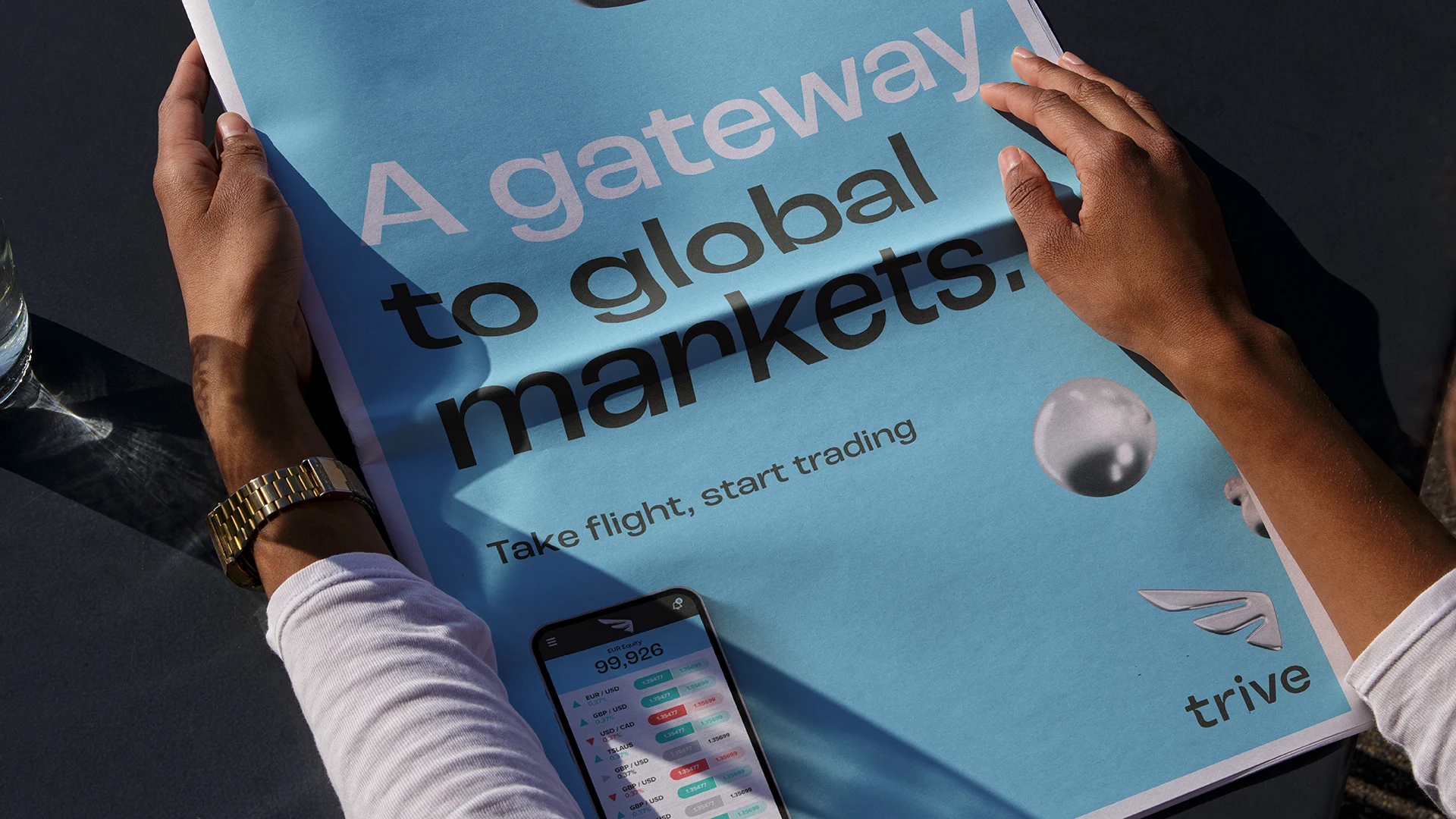
Trive is a consumer financial trading platform. It promises to help its investors take flight. Whilst trading is a serious business a modern, financially savvy, audience immediacy of day trading is exciting and aspirational. However the visual language of trading platforms is still dominated by graphs and numbers.
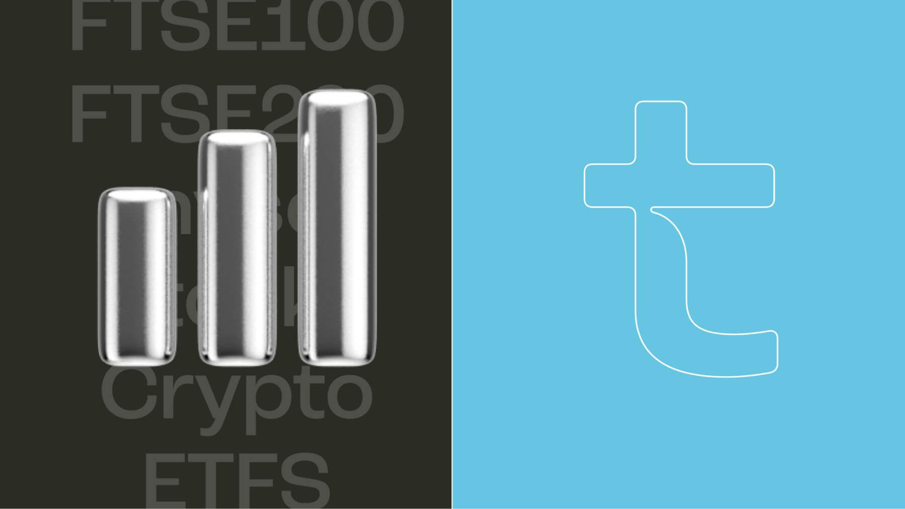
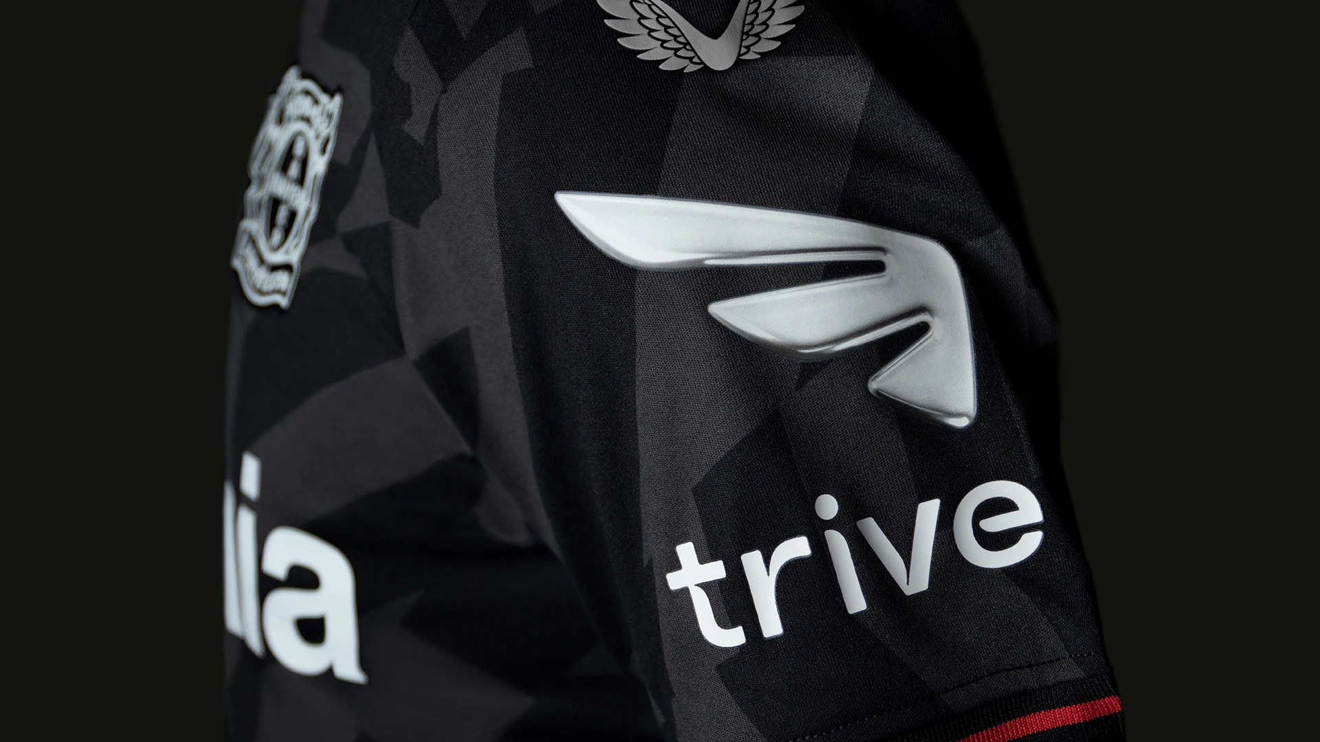
It was natural then that we landed on a wing of mercury for the centrepiece of this dynamic new brand identity. Trive comes alive in four dimensions with the liquid mercury forming and re-forming to create a dynamic moving logo, icons and other shapes that act as a framing device for the entire brand.
The Trive identity captures the spread and experience of the platform and the dynamism of the trading mindset, a moving graphic symbol of their promise ‘Never Standing Still’.


