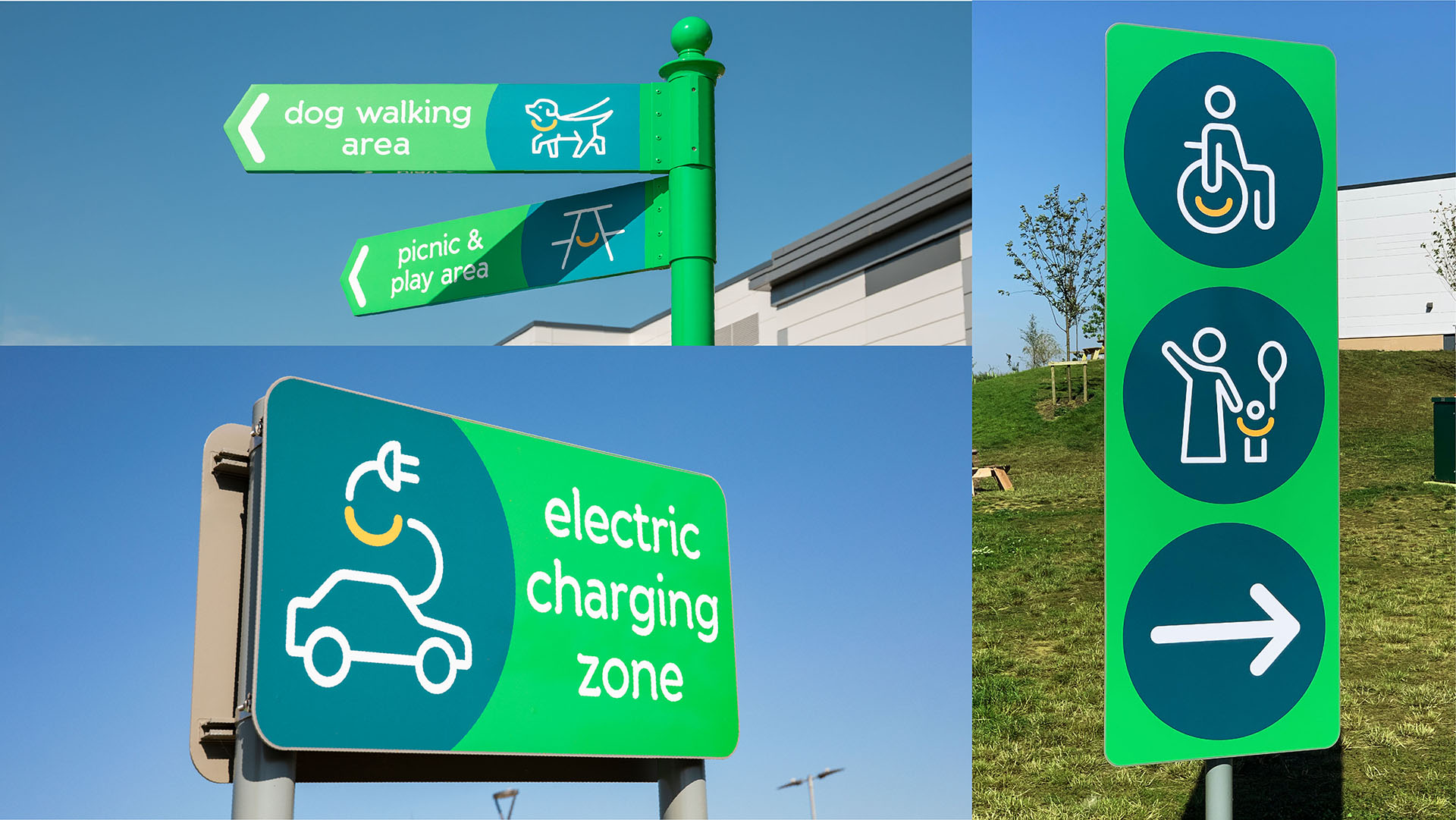
But if you’ve hit the road recently, you may have noticed that motorway service stations are upping their game. Gone are rest-stops that entail uninviting washrooms and underwhelming food choices. Instead, networks have introduced top notch amenities like ultra-fast electric charging points, high street retail and food brands, right through to family play areas and business lounges.
Travelling Brighter
Travelling Brighter
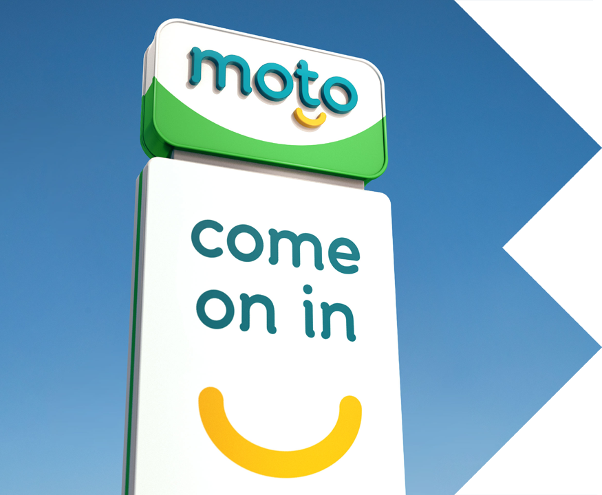
Following their mission of transforming the UK’s rest stop experience, we were brought in to support Moto's values and vision, ensuring their visual identity brought to life who they are today.
The new work aims to flip the switch by driving feeling over function – engaging customers on a much more emotional level – to ensure the motorway services provider became an active choice for resting and relaxing first.
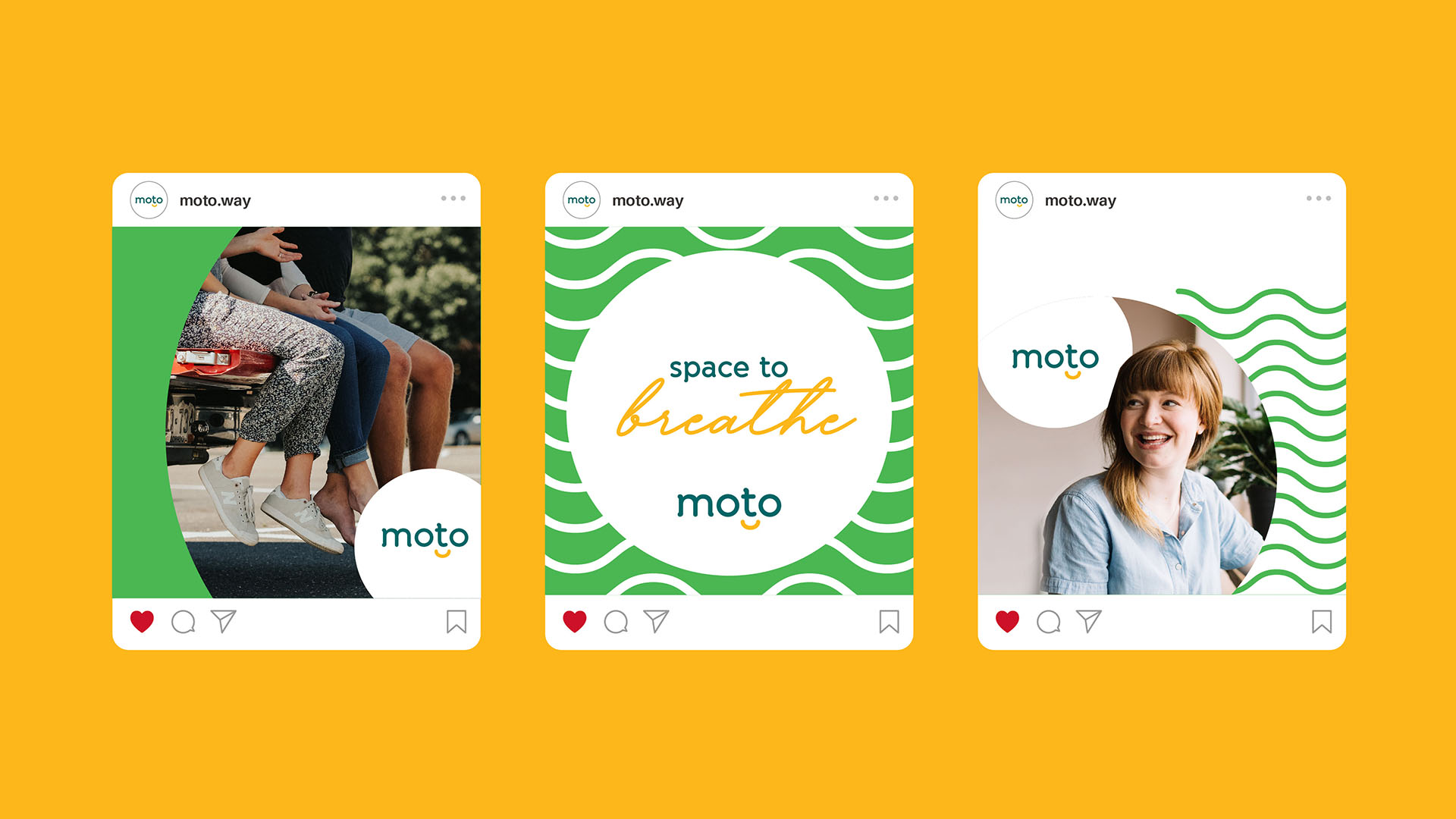
The recharged identity injects a good old dose of joy into the everyday. Here’s where we give you a ‘Smile’. A warm and inviting distinctive asset that can flex across the brand’s entire ecosystem – from signage and floor scrubbers to uniforms and Instagram.
A bold and bright colour palette draws out the brand’s green EV credentials and uplifting nature. Whilst a soft and approachable typeface, paired with a friendly and welcoming tone of voice, ensures the brand connects with levity and warmth.
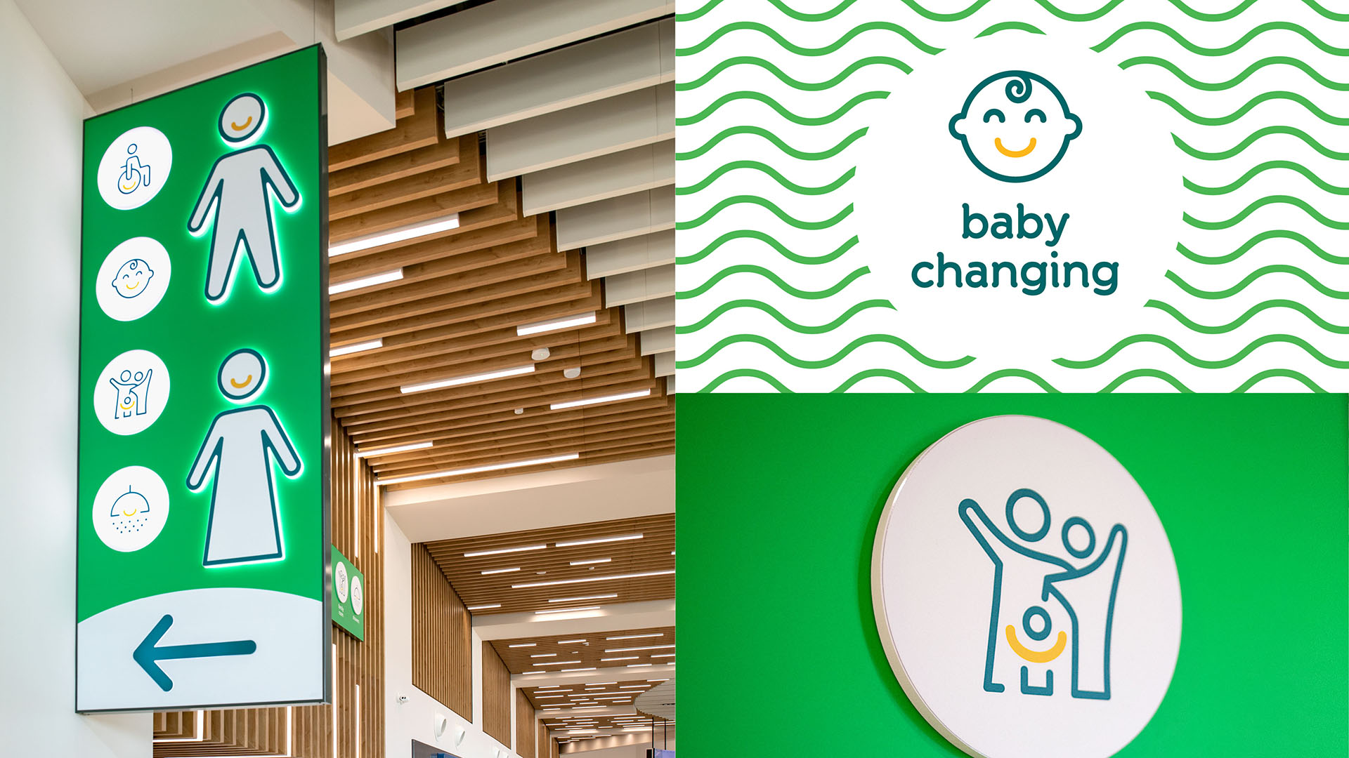
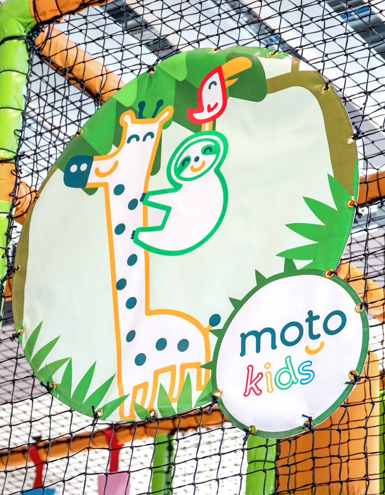
We also created an expansive suite of distinctive icons to aid wayfinding and signpost different zoned areas. Kid zones should be fun, so we took on a more playful feel, using linework illustrations in an expanded vibrant and upbeat colour palette.
