Ponzi
Nancy & Dick Ponzi planted their first vines in 1968, becoming one of the first families in Oregon wine. Groupe Bollinger acquired Ponzi Vineyards in 2021; their first property outside France, excited by the Ponzi family’s Burgundian inspiration and ability introduce North Americato finishes and flavors it had never experienced before.
With a design that didn’t reflect the artistry behind the brand nor establish Ponzi as a brand that could engage with consumers, we needed to reframe Ponzi Vineyards as the leading winery in Oregon. We built on the brand’s inherent sophistication to introduce a sense of Oregonian earthiness and create a harmonious balance between the two with an elevated expression that is unmistakably Ponzi and undeniably rooted in Oregon.
The new logo, a fundamental element of the winery’s visual identity is hand-written in style and inspired by Dick Ponzi’s own signature. It instantly sets a more personal tone and connection to the people behind every bottle.
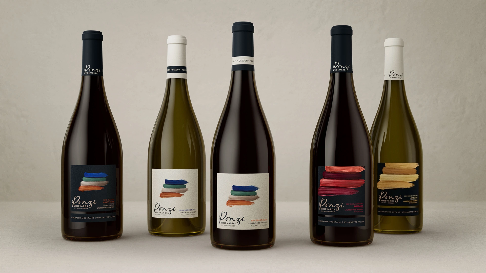
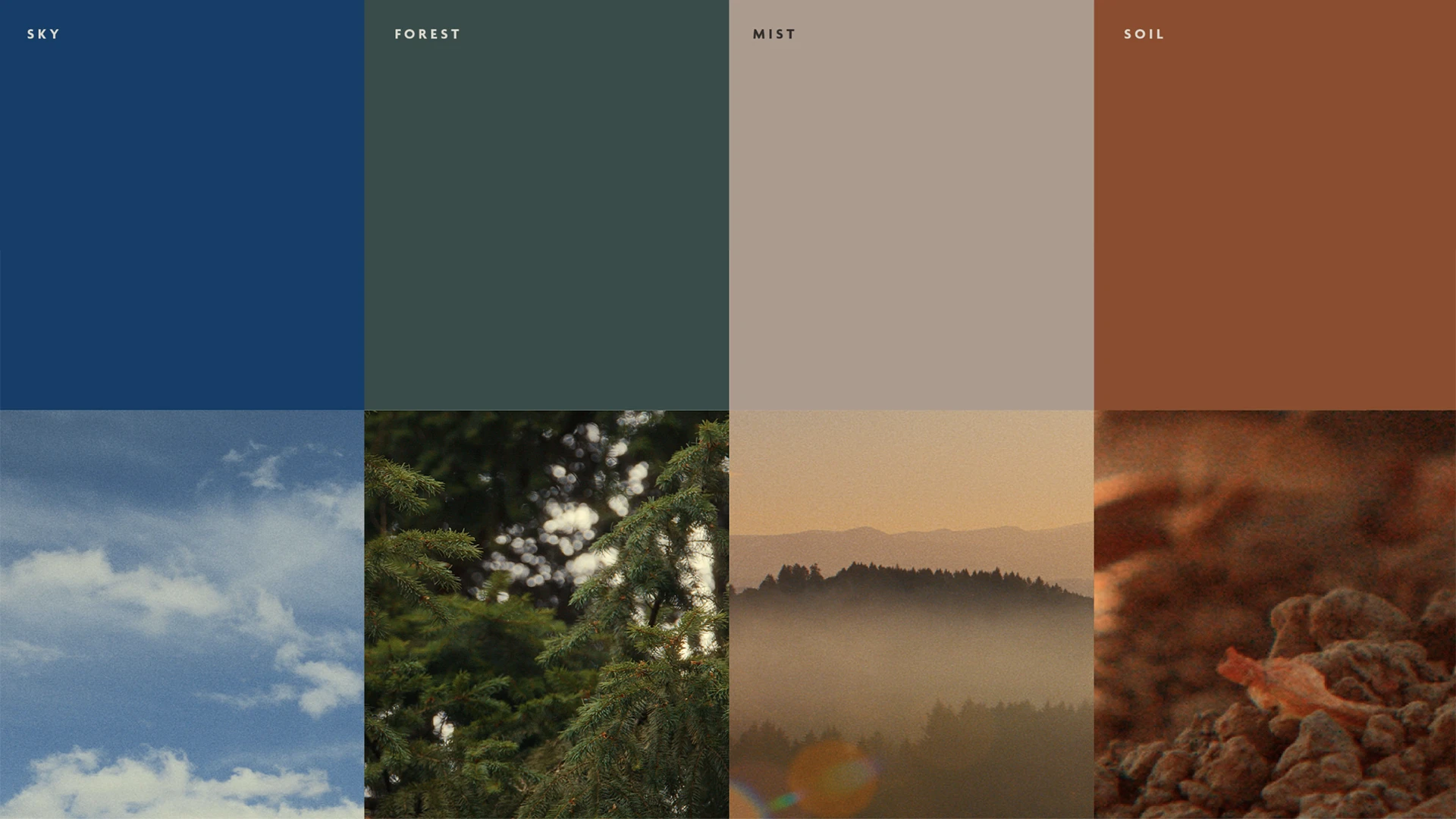
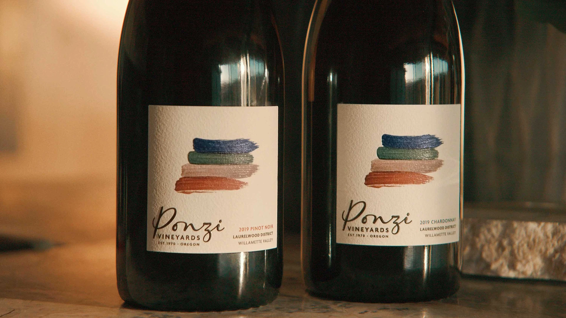
The packaging design and key graphic equities are centered around four expressive, earth-toned brushstrokes that encapsulate the Oregon landscape and the unique Laurelwood AVA. These refined and energetic brushstrokes embrace earthy artistry, representing key elements of the blue sky, cedar forest, rolling mist, and the Laurelwood AVA’s loess and volcanic soils. Simplicity, the ethos of Ponzi Vineyards, is revealed in these simple yet elegant colors. The layered brushstrokes also link to the winery’s gravity flow process and the philosophy of working in tandem with nature.

