Breaking Bread

Breaking Bread

Panera is one of America’s biggest and most loved restaurant chains. A true pioneer of clean food.

However, a shift in eating habits meant consumers were looking for food that is first and foremost desirable and makes you feel good.


Panera needed to reimagine how they were showing up in the world – from brand strategy right through to visual identity. We set out to redefine Panera by dialling up its deliciousness.


Shifting the narrative from naturally healthy to something more pleasure driven, we injected a big dose of enjoyment back into the brand. We started by crafting a more welcoming identity rooted in the idea of ‘breaking bread’.


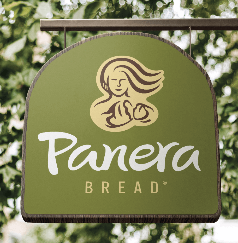
A simple act that symbolises generosity and togetherness. The new Mother Bread logo expresses warmth as she breaks bread and engages with you directly. More youthful and dynamic, her hair flows wild and free, evoking a sense of passion and energy.


We’ve redrawn the Panera logotype to make it more free-flowing and hand-written, bringing greater naturalness to the wordmark.

A new distinctive holding shape, inspired by a bread oven, reflects what’s at the heart of the brand: warmth and comfort.


Panera’s iconic colour palette has been maintained yet evolved to feel fresher and more energised, whilst simple and confident hand-drawn illustrations have been introduced to echo the ‘Mother Bread’ style. Giving Panera the ability to express its untamed abundance across the brand world.


“BrandOpus skilfully and meticulously uncovered a new direction within a shifting cultural landscape, helping us inspire our colleagues and franchisees.”

Eduardo Luz, Chief Concept Officer
Panera

WUNDA