Breaking Bread
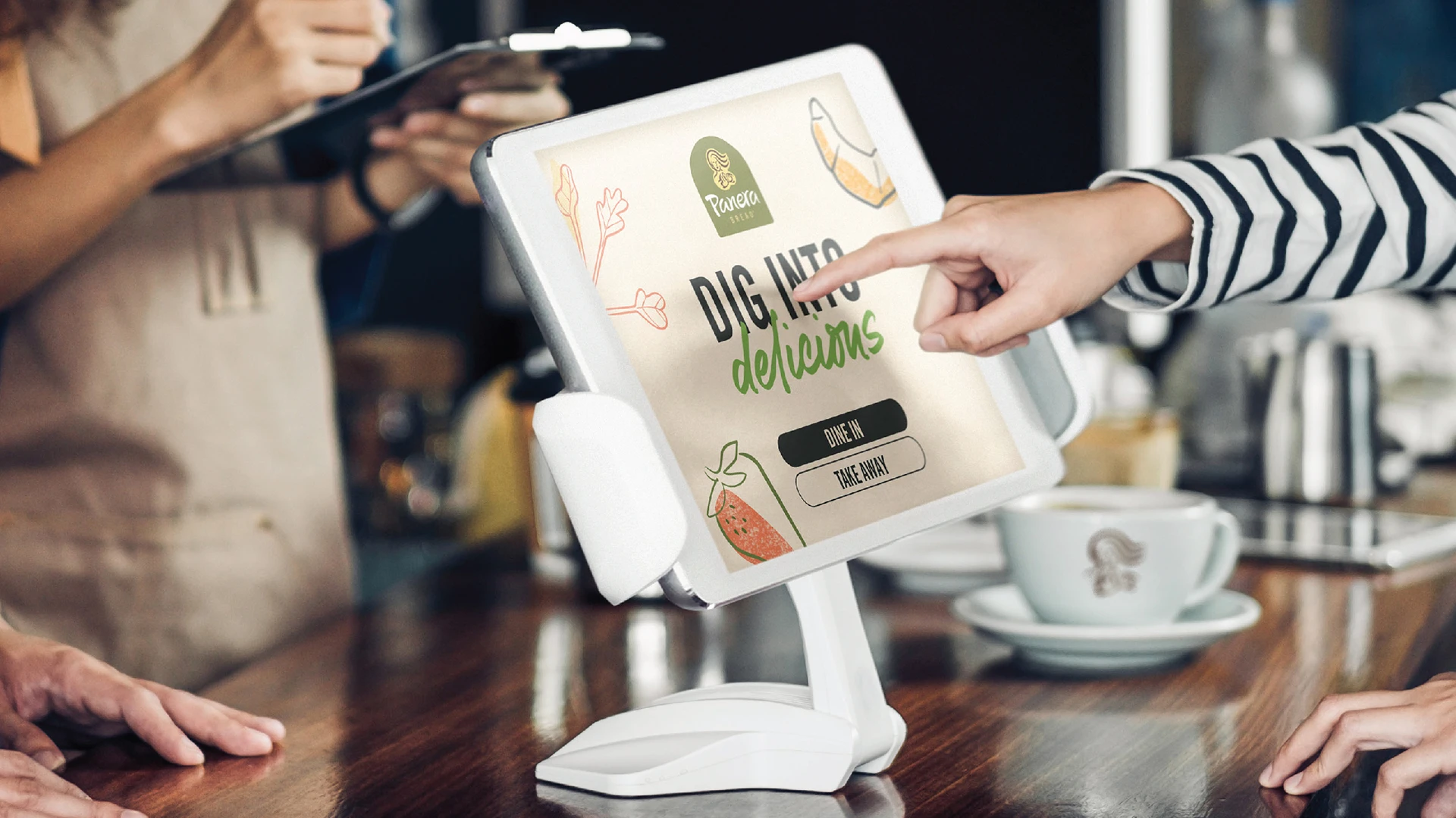
Panera, a QSR staple with over 2000 locations and a retail line, was falling behind competitors. The brand needed to shift from its clean eating image to a more pleasureful, abundant story that would resonate with consumers as a modern reflection of what it means to be healthy. The brand’s core message of clean food, while important, wasn’t enough to drive excitement or evoke taste appeal with consumers. Panera needed to reimagine how they were showing up in the world – from brand strategy right through to visual identity. We set out to redefine Panera by dialling up its deliciousness.
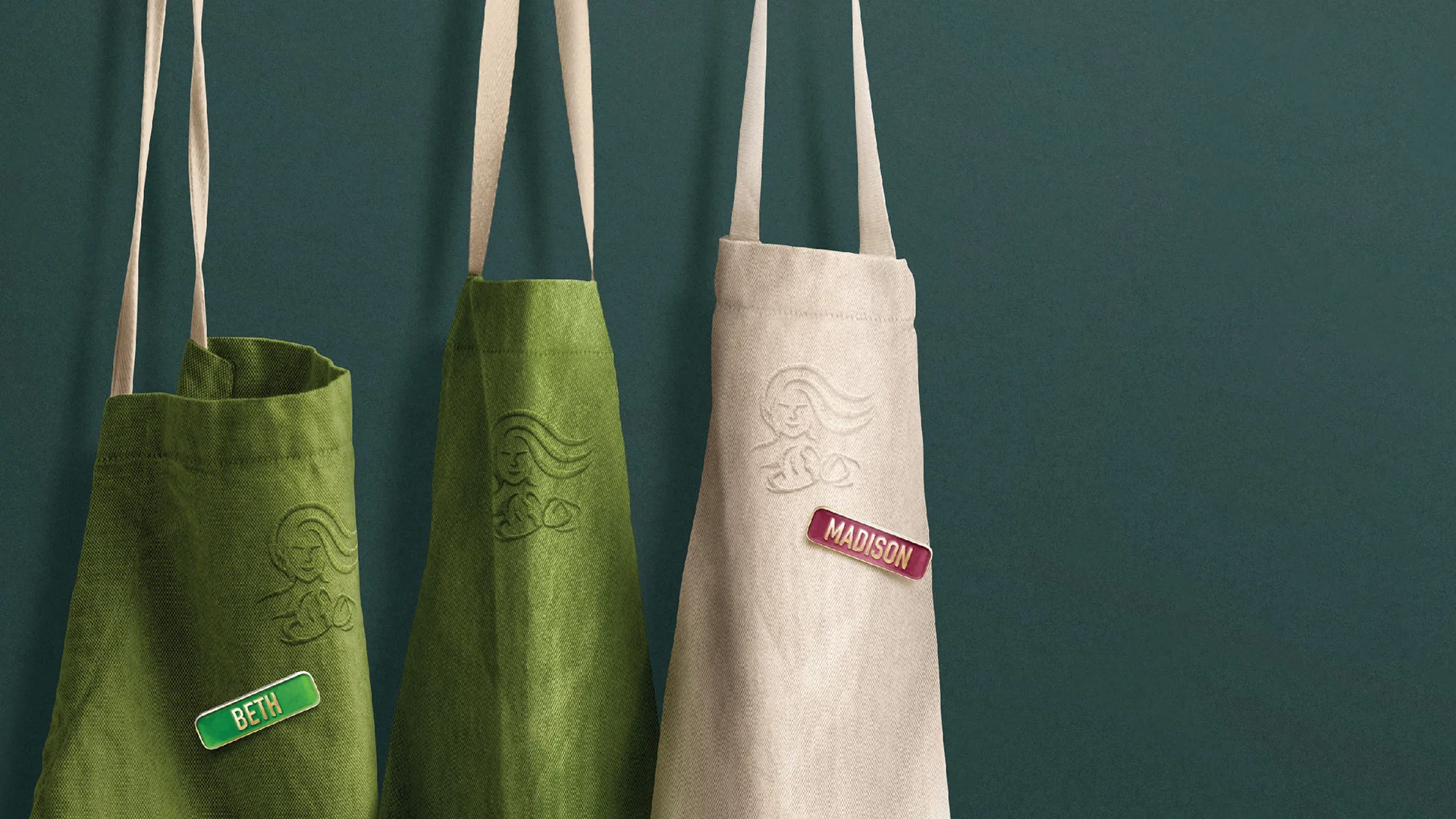
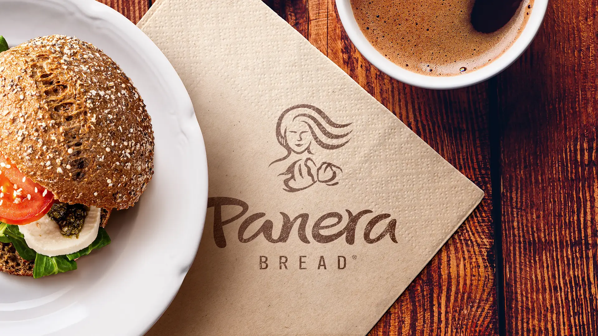
Shifting the narrative from naturally healthy to more pleasure-driven, we injected enjoyment back into the brand, crafting a welcoming identity rooted in the idea of ‘breaking bread’—a simple act symbolizing generosity and togetherness. The new Mother Bread logo expresses warmth, with her hair flowing wild and free, evoking passion and energy.
We redrew the logotype to be more free-flowing and hand-written, adding naturalness to the wordmark. A new holding shape, inspired by a bread oven, reflects warmth and comfort. Panera’s iconic color palette was maintained yet evolved to feel fresher and more energized, while hand-drawn illustrations echo the ‘Mother Bread’ style, expressing untamed abundance across the brand.