Although we’ve seen a recent increase in the nation looking to get fit and boost wellbeing through walking, British charity the Ramblers have been in the game for over 85 years. Their mission has always been to expand and protect the places people love to walk and to promote walking for pleasure. Today, the Ramblers have evolved from simply removing physical and legal barriers to walking, to tackling social barriers - like green equality.
Opening The Way
Opening The Way


With hundreds of local groups, the Ramblers needed to sit under one clear and compelling visual expression, that could flex across all touchpoints from digital to comms.
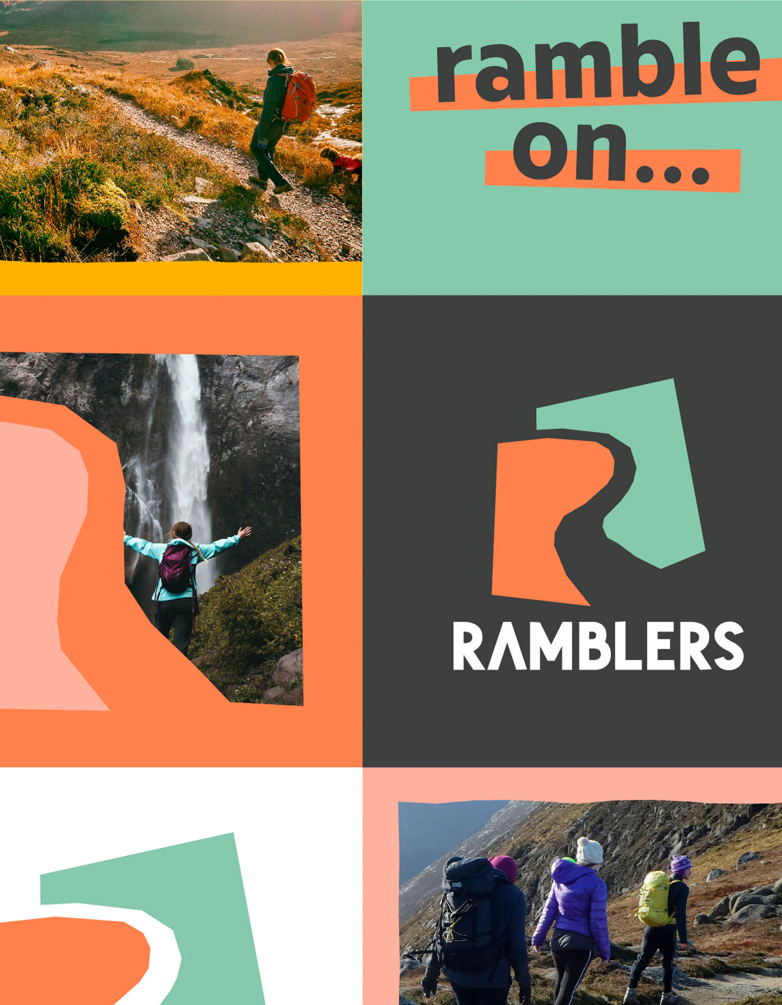
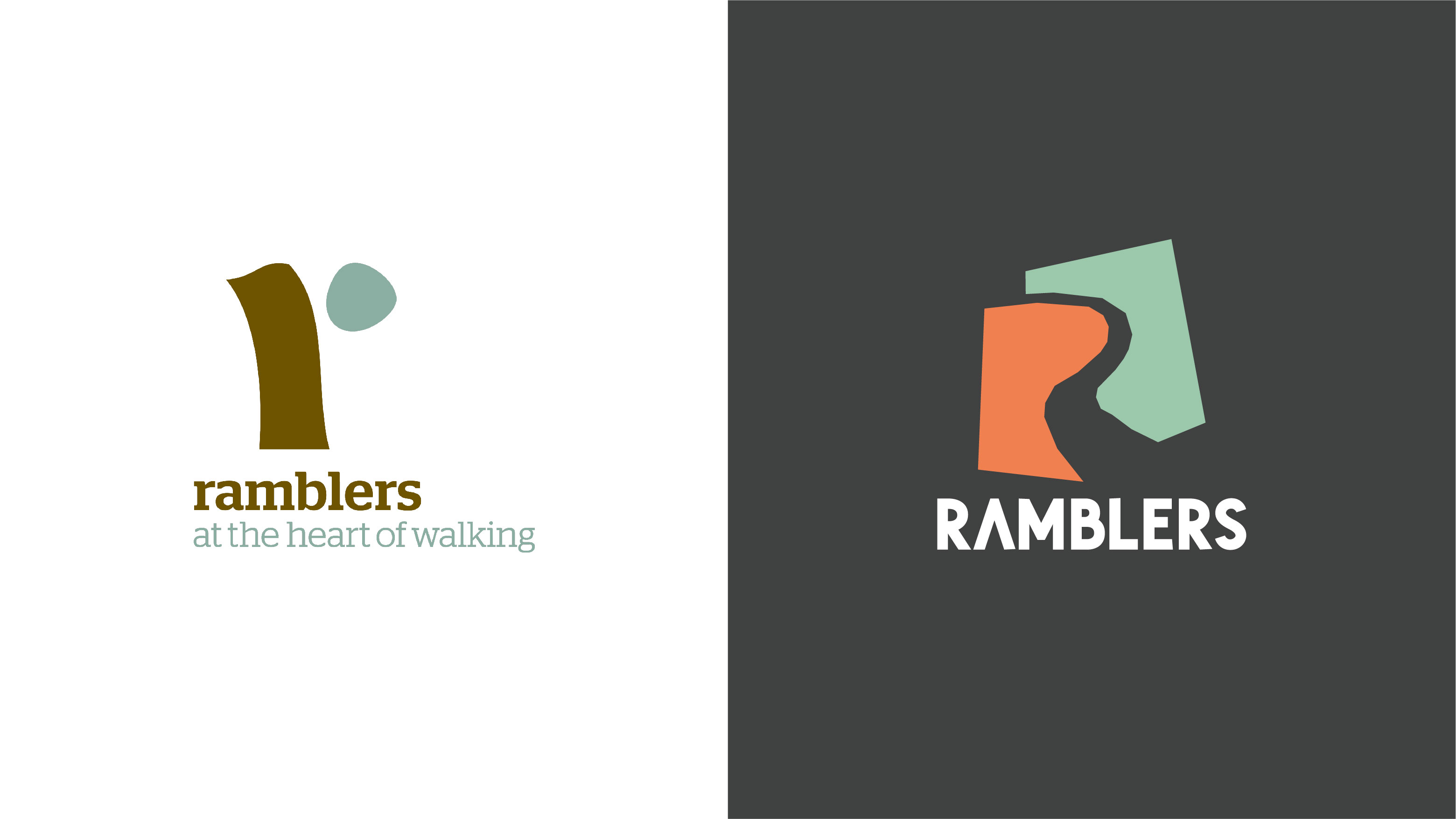
We transformed the charity from being seen as a lifestyle club for walkers, to an inclusive vibrant community unified by an important cause. Rooted in the idea of ‘opening the way’, the refreshingly bold identity comprises a papercut that crafts an open ‘R’ path, symbolising that anyone can create their own way through the landscape.
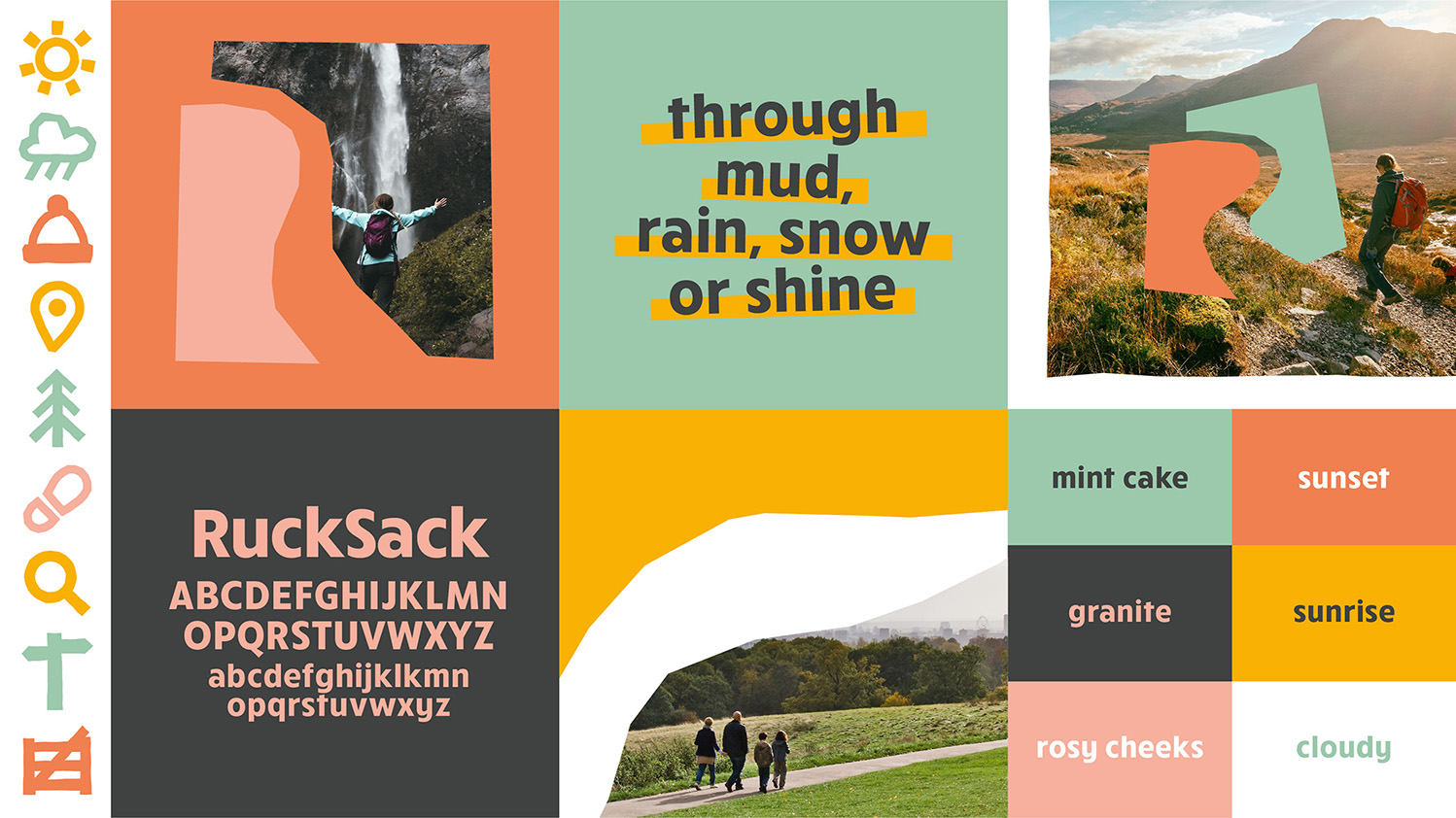
A reinvigorated colour palette of upbeat earthy tones instils a sense of warmth, whilst a confident ‘RuckSack’ typeface and papercut illustrations bring the open and active characteristics of the Ramblers to life through clean rounded shapes that emulate the outdoors. Natural and inclusive photography highlights the Ramblers experience, striving to show all walks of life across all terrains.
Not only has the Ramblers look and feel across the groups and nations logos been unified, the ‘Walking for Health’ initiative has been rebranded to ‘Wellbeing Walks’ to feel part of the Ramblers family.

