Mio
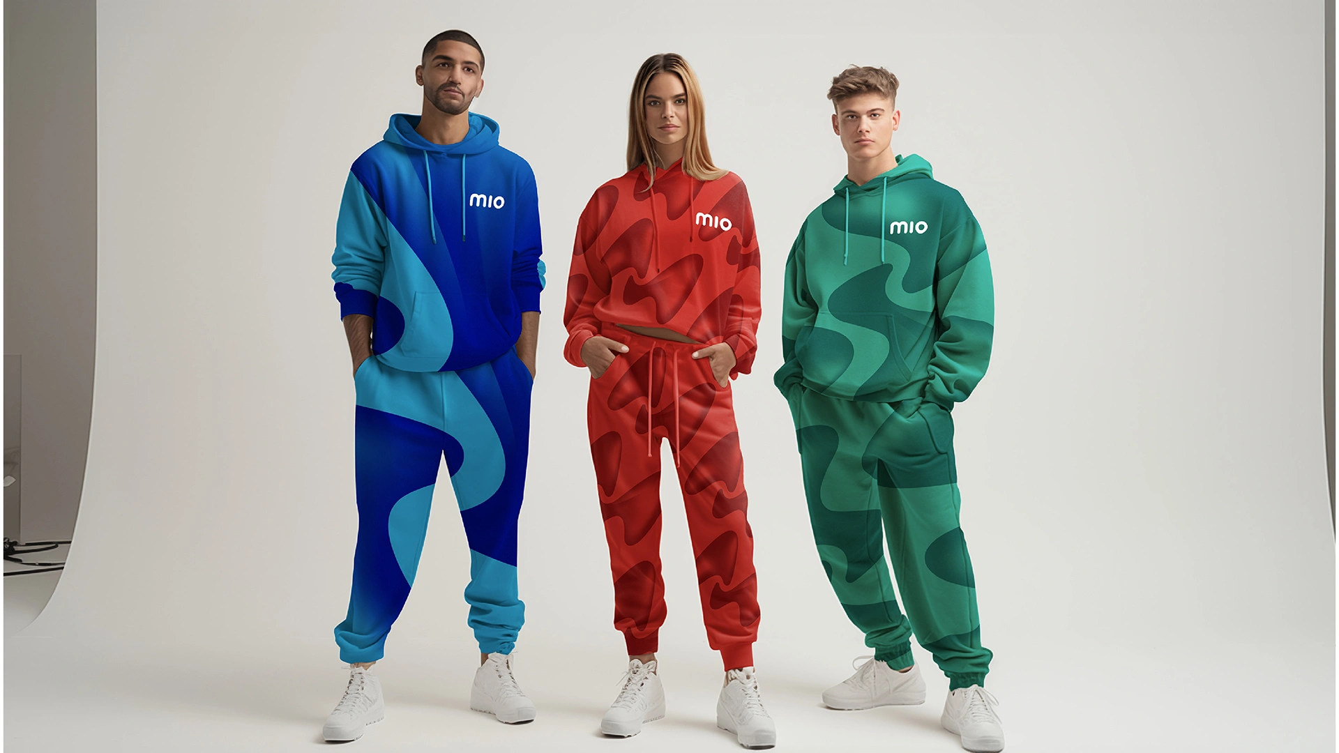
Mio’s transformation is a story of reinvention, embracing a bold new identity to meet the needs of a wellness-conscious Gen Z audience. It needed a refresh that felt as dynamic as it’s audience. With Wellness on your wavelength as the guiding idea, the brand shifted from being a solution to “fix water” to one that empowers personalised, accessible wellbeing for every moment.
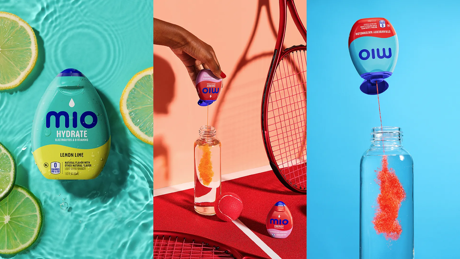
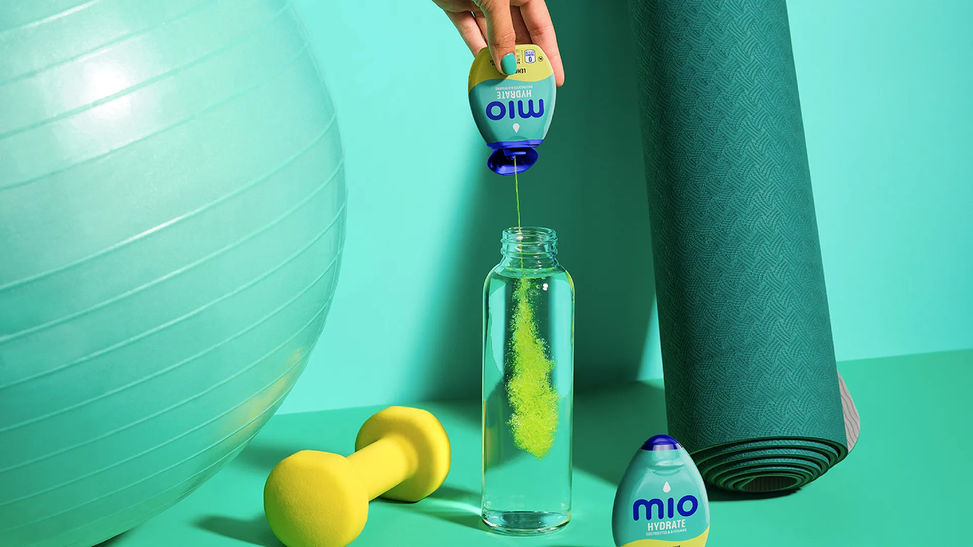
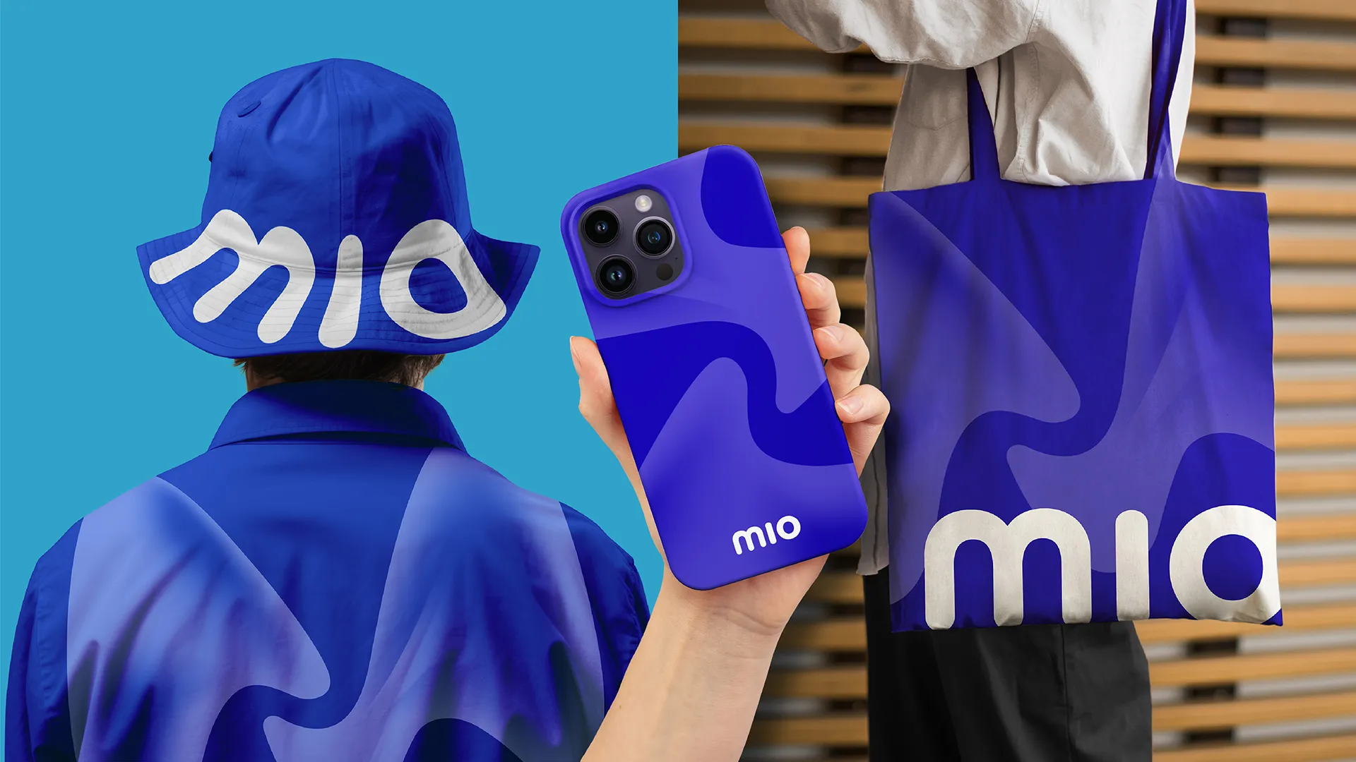
At the heart of the rebrand is the new M-wave, a symbol of balance, connection, and vibrancy. This distinctive asset is complemented by a refreshed logo featuring soft, rounded forms that feel approachable and modern. The cobalt and cyan blues of the new color palette create a calming yet dynamic tone, while benefit-led icons and wave patterns bring each product’s purpose to life.
The packaging is a breakthrough on the shelf, heroing Mio’s iconic bottle shape and creating a navigable system that makes choosing the right enhancer easy. The photographic “flume” imagery, showing the impact of Mio as it hits water, adds a splash of appetite appeal and reinforces the brand’s vibrant energy.
Mio’s refreshed identity is bold, approachable, and designed to meet Gen Z where they are. It redefines wellness as something personal and fluid, giving Mio a standout presence at the shelf and a deeper connection with its audience. With Wellness on your wavelength, Mio proves that even a small squeeze can make a big difference.