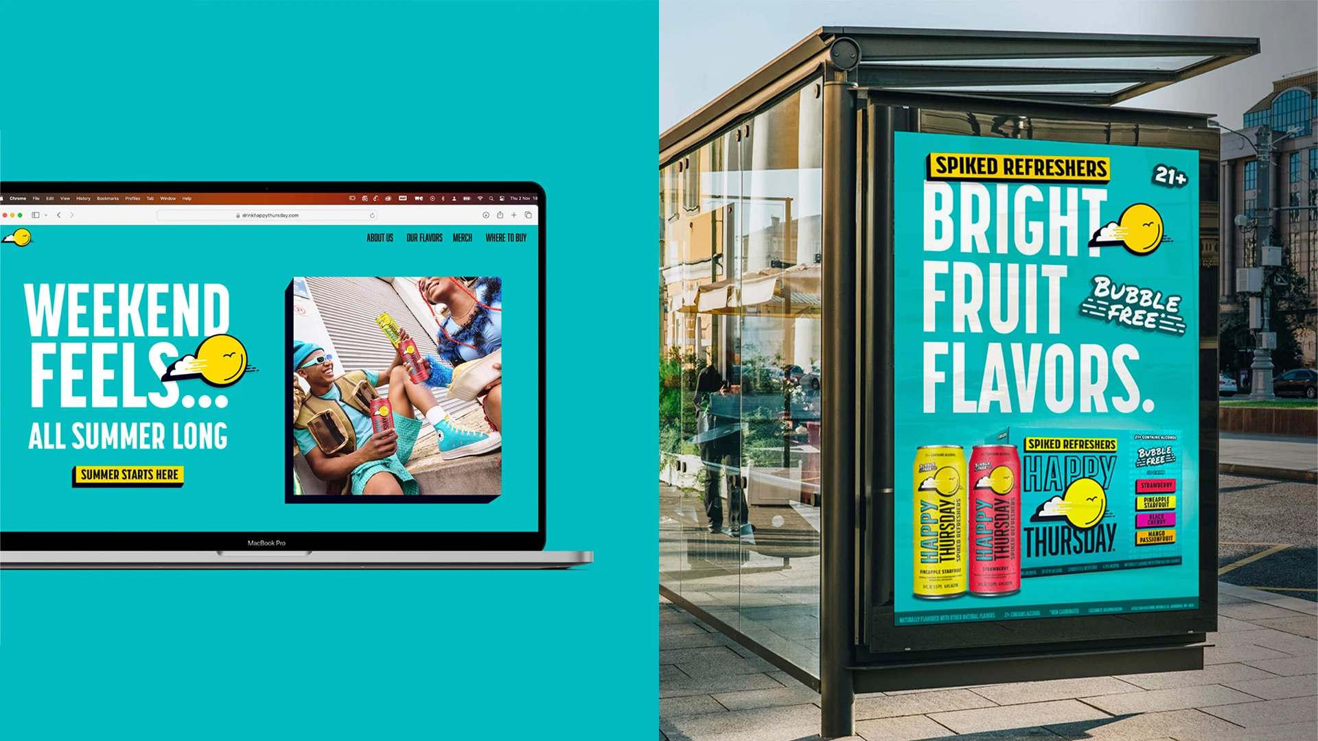
Happy Thursday
In a fast-paced and agile innovation process, Happy Thursday was launched as a new-to-the-world brand to create a new sub-category of spiked refreshers. Inspired by legal drinking age Gen Z-ers who are looking for something delicious that they can keep drinking without that filling fizz feeling, we needed to create a brand and packaging design that not only carried a clear narrative but could take ownership of this emerging space.
Happy Thursday is the antidote to the cloudy week - bringing the sunshine of the weekend feeling with the crack of a can. Giving consumers the agency to break free from the heaviness of the everyday and enjoy easy drinking, smooth fruit flavors.
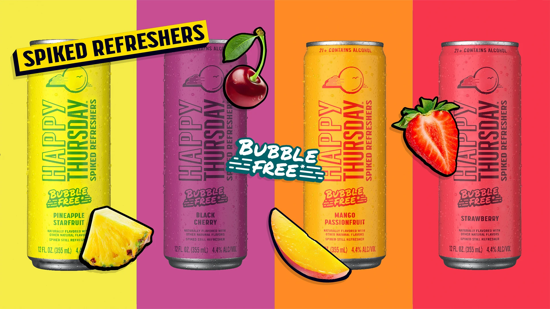
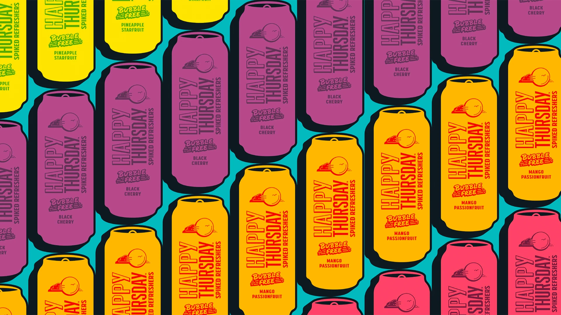
Building in consumer learnings and testing to iterate to great, the unique teal color and pop of yellow proved to create strong breakthrough at shelf, delivering straightforward simplicity. The sleek cans create the ultimate badge value and share-ability with a larger format calling to consumers in c-store.
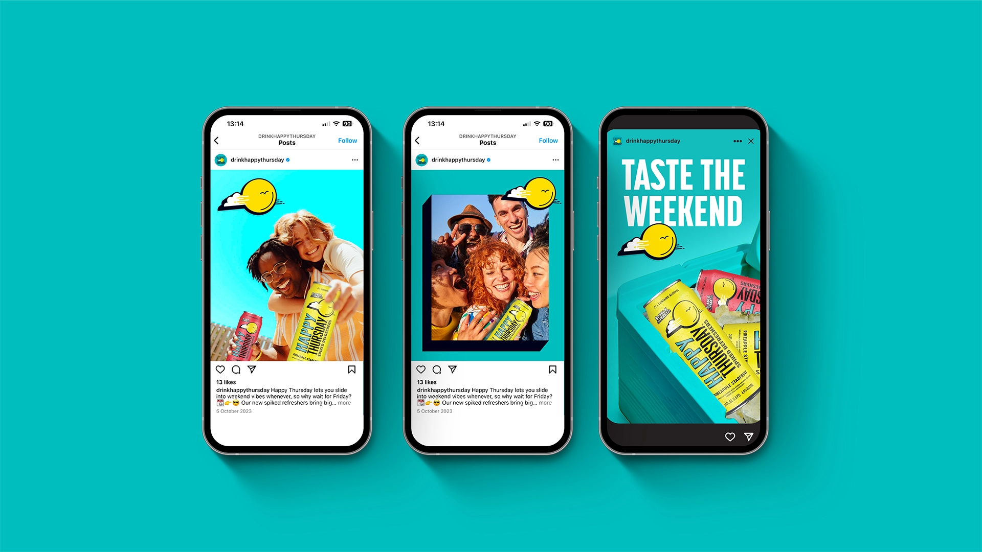
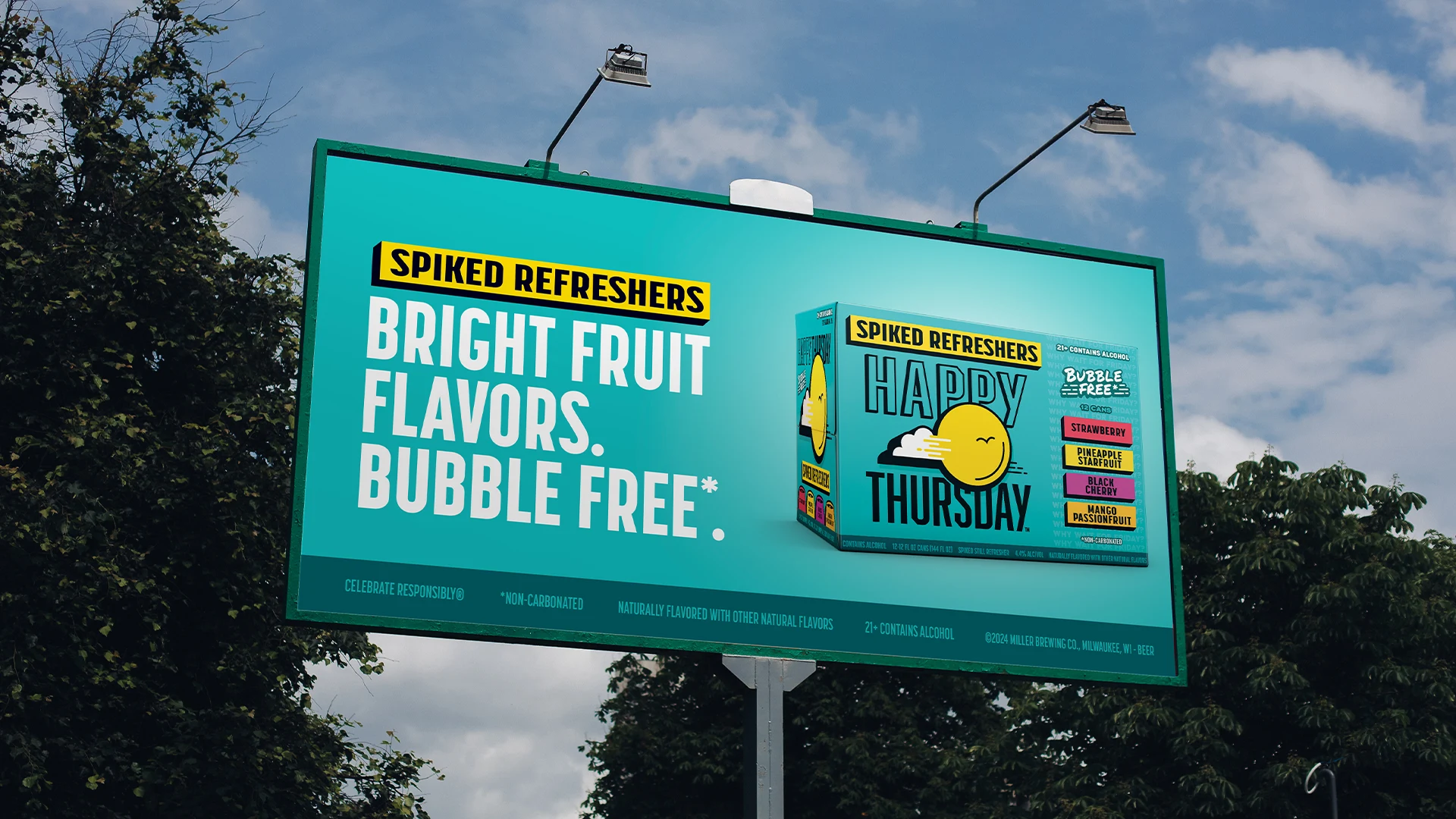
Supported by fun flavor slap tags inspired by street art and using bold, dimensional graphic styling reflective of the packaging, we built a tight brand world that establishes the new brand’s set of distinctive assets and invites consumers to get that weekend flavor any day of the week.
