A Human Touch For Digital

A Human Touch For The Digital Bank

When First Direct launched in 1989, it redefined what banking meant by bringing straightforward, customer-first, virtual banking to everyone.

Their challenger spirit made them the original disruptor to legacy banking. Fast-forward 30 years, and First Direct lacked the visual brand tools it needed to become a digital-first bank.


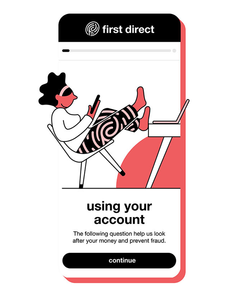
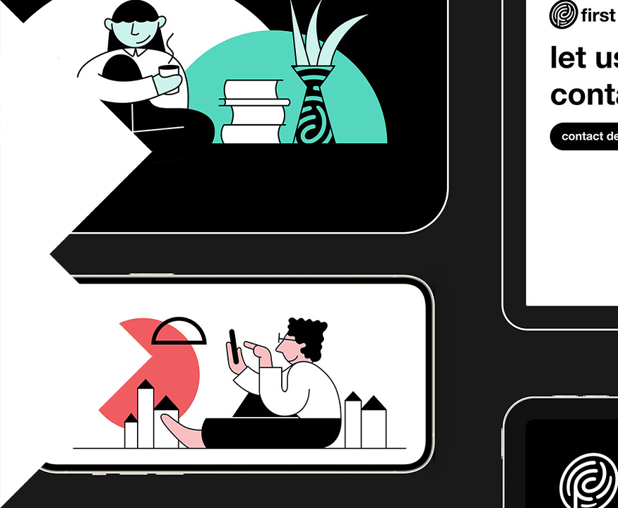
Visually, the brand did not have any distinctive or memorable assets beyond its black and white typeface. We set out to create an expansive suite of visual assets to drive consistency, recognition and individuality across the brand’s entire digital ecosystem.


Inspired by their humanity and customer service, we brought First Direct’s personal touch to the forefront. Building on their established iconic assets with a new symbol, that accentuates and complements their well-known wordmark.


We called it the ‘FD fingerprint’ and it’s more than a logo. It is a flexible brand icon that can be used across platforms to quickly and non-cognitively code that First Direct understands people, values their individuality and keeps their money secure.


At every step of the user experience, we wanted the bank to own its people-first narrative.


We introduced vibrant hits of color and a playfully expressive illustration style to bring a dose of warmth and humanity.

By retaining the iconic black and white color palette with Helvetica type, we’ve maintained their reassuringly straightforward tone.


“First Direct is a fabulous brand loved by its customers but it had long standing issues with brand awareness and misattribution. The brilliant team at BrandOpus were a critical partner in fixing this. As usual, working with them was collaborative, creative and fun - and the final solution was genius!”

Helen Priestley, Brand & Marketing Director
First Direct

MCCAIN