From Timeless to Toothless - Thoughts on the Lyle's Golden Syrup Redesign.
From Timeless to Toothless
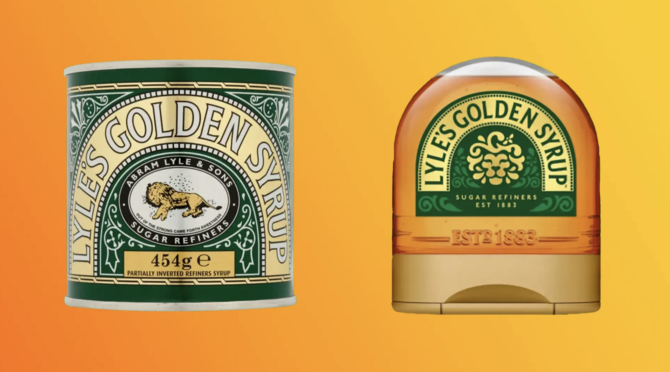
‘Out of the weak came forth blandness’
This is significant. The marginalisation of one of the most distinctive brand identities around. A personal favourite, I feel like I’m losing touch with one of my most trusted friends. The only saving grace is that the original tin will retain the iconic design. But therein lies the issue. It is neither suitable or sustainable for a brand to exist with two different identities, particularly when the symbolic meaning has shifted so significantly? For a brand to be effective in an increasingly fragmented world, with multiple channels and challenges for how it shows up, a confusion of meaning and connection across the brands identity will cause chaos in the consumer’s mind. Brand architecture becomes brand anarchy!
The need to continuously review and refresh the design of iconic brands is not my issue. The flagrant disregard of maintaining the long-standing brand meaning is. The new lion symbolism no longer represents the strength and fortitude evoked by the archetypal story from which the original was born. It is soft and gloopy, a caricature of a lion more suited to a role on the ‘Masked Singer’ than an emblem of strength and sweetness. Too focussed on evoking the generic product attributes of golden syrup to retain the unique quirk and impact of a brand that has proudly stood out from the crowd for its entire existence. And this shift has influenced the overall look and feel of the new design. What once felt like bold iconic craftsmanship and quality of a bygone era now feels soft, passive and tame. Arguably more modern, but lacking the substance that has underpinned the Lyle’s brand for 150 years.
The key to refreshing a legacy brand is the art of looking backwards and forwards at the same time. We must identify the equity and assets that are imperative before you can reimagine the brands look and feel in a way that carries its meaning and memory structures with you. The most effective brand redesigns reimagine rather than reinvent. Consumers accept the new design as the brand they know and love whilst seeing it through a new lens of relevance. The new redesign of Lyle’s Golden Syrup does not achieve this.
Since the rebrand has gone live, there has been lots of discussion regarding the dead lion. Surprise at its existence on a food product, revelation that it is a dead lion as people had not realised that before, questioning of its relevance due to the morbid reality or its biblical roots. I don’t think any of this is where the actual discussion should be. The real question is why did Abram Lyle intentionally choose this narrative and symbol for his brand. Is it because it represents the values and principles of the business and brand that he founded; strength, fortitude, positivity from adversity. Who knows. But his choice of narrative will have guided and informed how the business and brand has been shaped and developed over its 150 years of existence. Whether or not consumers understood why a dead lion was on the pack is neither here nor there, but for certain, what they think and believe about the brand has been embedded by that narrative choice.
The new design represents a change in narrative, when there was no need for the narrative to change. Perhaps the visual expression did need modernising, but the narrative and symbolic meaning should not be considered out of step with the next generation. Those archetypal stories and symbols continue to power many brands today, whether it be the siren for Starbucks or Medusa for Versace, they have undergone renovation to keep them moving with the times without departing from the founder’s vision of what the brand should stand for in consumers’ minds.
Paul Taylor, Chief Creative Officer at BrandOpus